After having a examination class this morning, my classmate has told me to make a Shirt design. This design is supposed to be use at the
Pharmacy's Anniversary ceremony. He told me to finish the design tomorrow. Pretty fast for me to make a good design in night..But I try, then here they are the result. The first time you lool at the shirt design, may be you'll think that the shirt's color and the ornaments doesn't match. My friend told me to use an specific color that's called "merah marun" in Indonesian. And I couldn't find it on adobe illustrator. So I use this based old red color to represent the real color.

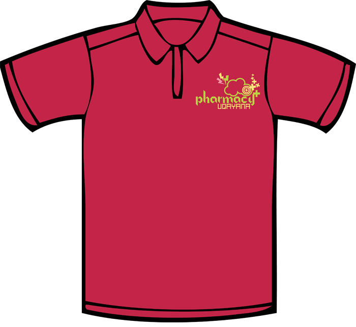
This is the front-side of the Shirt design. I was so confuse when I try to pick some color to matched with the base color of the Shirt. There was 3 color that I have to pick.
After trying and error for a few times finally I pick these color, pink, green and yellow. I hope that the color combinations will match wtih the real Shirt color. Usually, as what I've seen before, choosing a shirt color is being complicated. The colors that's we pick on the computer is different with the reality. Then, the design compotition between the shirt ornaments and the shirt itself sometimes doesn't match the following idea.
 And this is the back side. I simply put simple text on back side. It's represent the Pharmacy's theme, Unity in Diversity. The position of the text on the right side, below the hand's hole. I prefer to put in that location, I thought that was the eyecatching part of the shirt. Do you asking..what kind of font that I've been use on it? So, here is the answer...I use Pricedown and Quart. If you looking for this font you can googling, and use the name of the font as keyword, totally free. I wish this post will inspire you to make a better one. That's all for this post..see you et the next post..
 This is the front-side of the Shirt design. I was so confuse when I try to pick some color to matched with the base color of the Shirt. There was 3 color that I have to pick. After trying and error for a few times finally I pick these color, pink, green and yellow. I hope that the color combinations will match wtih the real Shirt color. Usually, as what I've seen before, choosing a shirt color is being complicated. The colors that's we pick on the computer is different with the reality. Then, the design compotition between the shirt ornaments and the shirt itself sometimes doesn't match the following idea.
 And this is the back side. I simply put simple text on back side. It's represent the Pharmacy's theme, Unity in Diversity. The position of the text on the right side, below the hand's hole. I prefer to put in that location, I thought that was the eyecatching part of the shirt. Do you asking..what kind of font that I've been use on it? So, here is the answer...I use Pricedown and Quart. If you looking for this font you can googling, and use the name of the font as keyword, totally free. I wish this post will inspire you to make a better one. That's all for this post..see you et the next post..